Plotting Fixed Effect from Multilevel Models
This guide demonstrates how to plot a fixed (average) effect from a multilevel model in R.
library(lme4)
library(lmerTest)
library(ggplot2)
library(bmlm)
library(brms)
library(gridExtra)
Load example dataset (from bmlm package)
For this demo, we will use the BLch9 dataset available
through the bmlm package for R. The BLch9
dataset comes from the example used in Chapter 9 of Intensive
Longitudinal Methods by Niall Bolger & J-P Laurenceau. (The
book is great, by the way, and I highly recommend it.)
For details on this dataset, run ?BLch9.
d <- BLch9Frequentist Approach using lme4
Fit example model
First, we will fit a multilevel model in which x and
m predict our outcome variable, freldis. We
will include x and m as fixed effects and
allow for each of these effects to vary between persons through the
inclusion of random effect terms.
Note that x and m have already been
person-centered.
fit <- lmer(freldis ~ x + m + (x + m | id), data = d)summary(fit)## Linear mixed model fit by REML. t-tests use Satterthwaite's method [
## lmerModLmerTest]
## Formula: freldis ~ x + m + (x + m | id)
## Data: d
##
## REML criterion at convergence: 6137.8
##
## Scaled residuals:
## Min 1Q Median 3Q Max
## -3.3809 -0.6185 -0.0114 0.6423 3.3383
##
## Random effects:
## Groups Name Variance Std.Dev. Corr
## id (Intercept) 0.930772 0.96477
## x 0.008266 0.09092 0.28
## m 0.047247 0.21736 0.63 0.92
## Residual 0.900109 0.94874
## Number of obs: 2100, groups: id, 100
##
## Fixed effects:
## Estimate Std. Error df t value Pr(>|t|)
## (Intercept) 4.63538 0.09867 99.00091 46.977 < 2e-16 ***
## x 0.11202 0.02319 201.80312 4.831 2.68e-06 ***
## m 0.15359 0.02889 102.80526 5.317 6.19e-07 ***
## ---
## Signif. codes: 0 '***' 0.001 '**' 0.01 '*' 0.05 '.' 0.1 ' ' 1
##
## Correlation of Fixed Effects:
## (Intr) x
## x 0.109
## m 0.466 0.186
## optimizer (nloptwrap) convergence code: 0 (OK)
## boundary (singular) fit: see help('isSingular')We can see from the model output that there is a significant effect
of x on freldis for the typical person,
adjusting for m. Now, we will plot this effect.
Create New Dataframe
To generate a plot of this effect, we want to use the model predicted
values. To do this, we will first create new df with all observed values
of x, with m held constant at 0 (indicating
the mean value of m for each subject). We will have our new
x consist of values falling in the observed range of values
(i.e., from the minimum observed x in the dataset to the
maximum observed x in the dataset). We will generate values
in .01 unit increments. This will help ensure that the CIs will be
smooth for plotting.
mydata <- data.frame(
                     x = seq(min(d$x), max(d$x), .01),
                       m = 0
                       )
Specify Design Matrix with Fixed Effects
Next, we will create a design matrix to obtain the fixed effect of
x.
fit.mat <- model.matrix(~ x + m, mydata)
cis <- diag(fit.mat %*% tcrossprod(vcov(fit), fit.mat))
We will then use the new dataframe we created to predict values of
our outcomes, freldis, from the model. Note that
predictions for the lower and upper bounds of the 95% CI are generated
in separate steps.
# predict y values and lwr/upr bounds using model object and new data
mydata$freldis <- predict(fit, mydata, re.form = NA)
mydata$lwr <- mydata$freldis-1.96*sqrt(cis)
mydata$upr <- mydata$freldis+1.96*sqrt(cis)
Plot Fixed Effect
Now, we will use the ggplot2() package to plot our
results. We will plot the raw data points (jittered, whereby we
introduce a small amount of random noise to prevent individual points
from stacking on top of each other) in the first part of the code. In
the second part of the code, we will then plot the model-predicted line
and 95% CI showing the fixed effect of x on
freldis controlling for m.
mlmplot <- ggplot(mydata, aes(x, freldis)) +
  geom_point(
    data = d,
    aes(x, freldis),
    position = position_jitter(h = 0.1, w = 0.2),
    alpha = .2,
    color = "black",
    size = .5
  ) +
  geom_ribbon(data = mydata, aes(ymin = lwr, ymax = upr),
              alpha = .3, fill = "red") +
  geom_line(data = mydata, aes(x, freldis), size = 1, color = "red") +
  xlim(-3, 3) +
  labs(x = "x (within-person centered)",
       y = "freldis",
       title = "lmer Version") +
  theme_bw()
mlmplot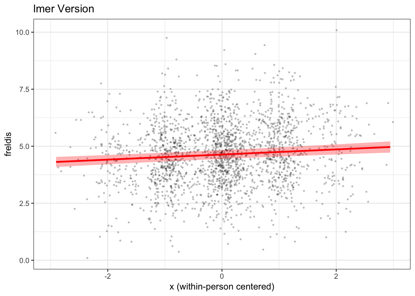
We have now plotted the fixed effect of x from our
lmer() model, taking covariate m into
account.
Bayesian Approach using brms
In this next part of the demo, we will fit the same model using
Bayesian estimation with the brms package, and use the
results of this model to plot the same fixed effect of x on
freldis controlling for m.
Fit example model
First, let’s fit the model. We will fit the same model as above. The
code is extremely similar to the code used to run our
lmer() model. We will use the default (noninformative)
priors from the package.
Note that brm() models often take a few minutes to
run.
fitb <- brms::brm(freldis ~ x + m + (x + m | id), data = d)print(summary(fitb), digits = 3)## Family: gaussian
## Links: mu = identity; sigma = identity
## Formula: freldis ~ x + m + (x + m | id)
## Data: d (Number of observations: 2100)
## Draws: 4 chains, each with iter = 2000; warmup = 1000; thin = 1;
## total post-warmup draws = 4000
##
## Group-Level Effects:
## ~id (Number of levels: 100)
## Estimate Est.Error l-95% CI u-95% CI Rhat Bulk_ESS Tail_ESS
## sd(Intercept) 0.974 0.074 0.843 1.132 1.002 824 1673
## sd(x) 0.084 0.032 0.017 0.146 1.004 557 270
## sd(m) 0.222 0.027 0.172 0.278 1.001 2478 3078
## cor(Intercept,x) 0.249 0.266 -0.301 0.745 1.001 4736 1962
## cor(Intercept,m) 0.594 0.103 0.377 0.777 1.001 2629 3193
## cor(x,m) 0.697 0.237 0.112 0.971 1.007 457 328
##
## Population-Level Effects:
## Estimate Est.Error l-95% CI u-95% CI Rhat Bulk_ESS Tail_ESS
## Intercept 4.636 0.102 4.437 4.839 1.003 340 966
## x 0.111 0.023 0.065 0.156 1.002 6618 2538
## m 0.155 0.029 0.098 0.211 1.000 1486 2899
##
## Family Specific Parameters:
## Estimate Est.Error l-95% CI u-95% CI Rhat Bulk_ESS Tail_ESS
## sigma 0.950 0.016 0.921 0.981 1.002 7035 3269
##
## Draws were sampled using sampling(NUTS). For each parameter, Bulk_ESS
## and Tail_ESS are effective sample size measures, and Rhat is the potential
## scale reduction factor on split chains (at convergence, Rhat = 1).Create New Dataframe
Now, we will create a new dataframe, similar to above.
mydatab <- data.frame(
  id = d$id,
  x = d$x,
  m = 0
)
Next, we will use the fitted() function in
brms to generate predictions and the 95% credibility
interval. We will append these predicted values to our
mydatab dataframe.
Note that brms features both a fitted()
function and a predict() function, but they will return
different information. The fitted line should be the same for both, but
the credibility intervals differ. fitted() takes
uncertainty of the estimation of the fitted line into account, whereas
predict() takes into account both uncertainty about the
estimation of the fitted line and uncertainty about the data. Thus,
predict() in brms will yield a wider interval.
fitted() closely matches the predicted interval we get from
the lmer() model.
mydatab <- cbind(mydatab, fitted(fitb, mydatab, re_formula=NA))
colnames(mydatab) <- c("id", "x", "m", "estimate", "error", "lwr", "upr")
Now, we can use ggplot2() to plot the results.
mlmplotb <- ggplot(mydatab, aes(x, estimate)) +
  geom_point(
    data = d,
    aes(x, freldis),
    position = position_jitter(h = 0.1, w = 0.2),
    alpha = .2,
    color = "black",
    size = .5
  ) +
 geom_ribbon(data = mydatab, aes(ymin = lwr, ymax = upr),
             alpha = .3, fill = "red") +
  geom_line(data = mydatab, aes(x, estimate),
            size = 1, color = "red") +
  xlim(-3, 3) +
  labs(x = "x (within-person centered)",
       y = "freldis",
       title = "brms Version") +
  theme_bw()
mlmplotb
How do the plots using lme4 and brms
compare?
Now, let’s compare the two plots side by side.
grid.arrange(mlmplot, mlmplotb, ncol = 2)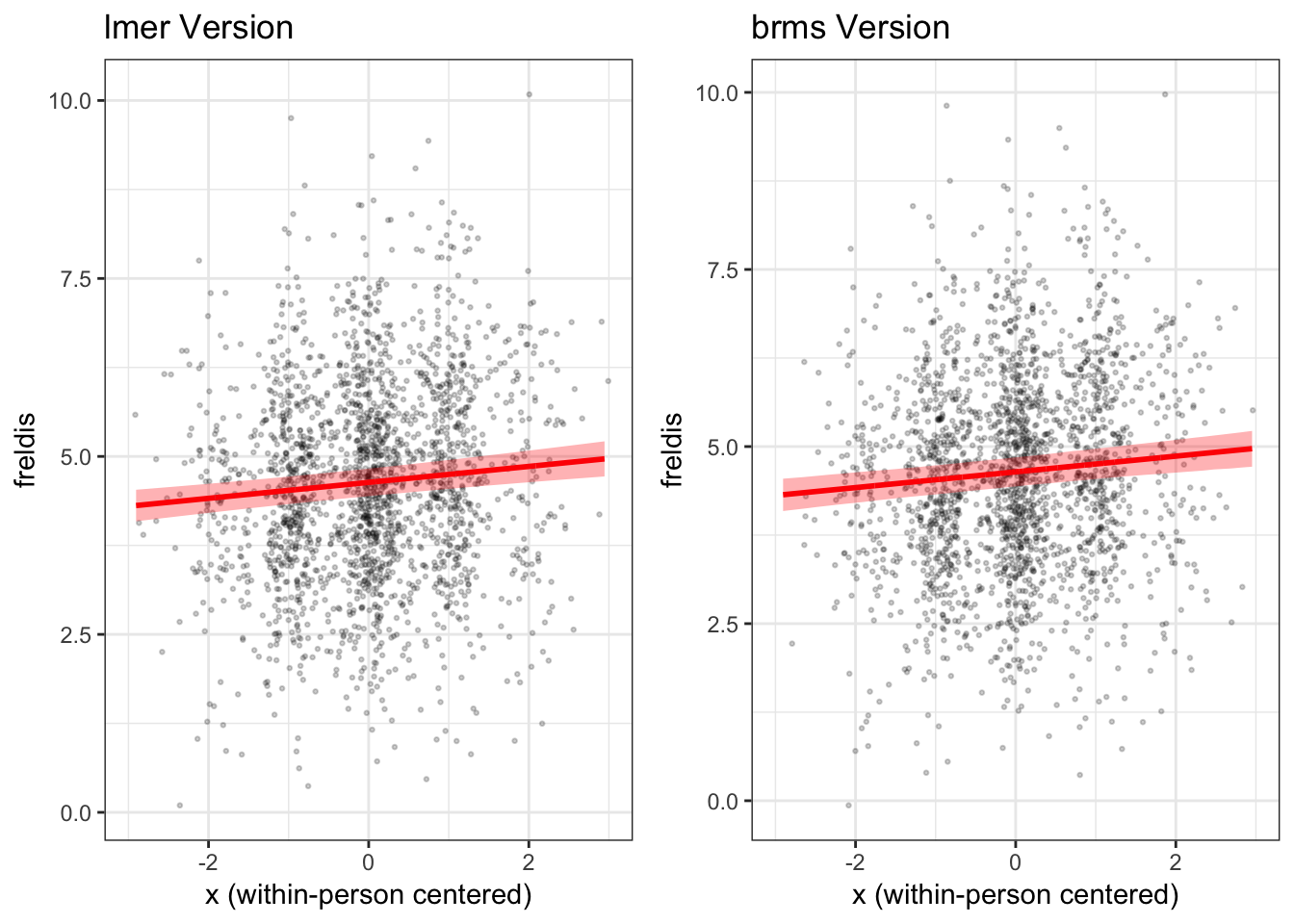
We find that in this case the fixed effect of x on
freldis is essentially the same across the two types of
models.
Wait, can’t I just use the built-in functions available through
ggplot2()?
At this point you may be asking yourself why we have to go to the
bother of creating a new dataframe and using it to generate predictions
from the model when ggplot2() offers features that allow us
to to draw a regression line and add a confidence band.
The answer is that ggplot does not “know” what is in our model. The
exception is when you have a very simple model, such as x predicting y
in a (non-multilevel) regression with no other variables. In this case,
ggplot does not know that we used a multilevel model (observations
nested within individuals), nor does it know that the effect of
x is adjusting for a covariate, m in this
case.
Here’s what we get when we simply use ggplot to generate our figure, without using the model to predict our fitted line and confidence band.
plot_gg <- ggplot(d, aes(x, freldis)) +
  geom_point(position = position_jitter(h=0.1, w=0.2),
             alpha=.2, color = "black", size = .5) +
  geom_smooth(method='lm', size = 1, color = "red", fill = "red") +

    labs(x = "x (within-person centered)",
       y = "freldis",
       title = "ggplot built-in lm()") +
    xlim(-3, 3) +
  theme_bw()
plot_gg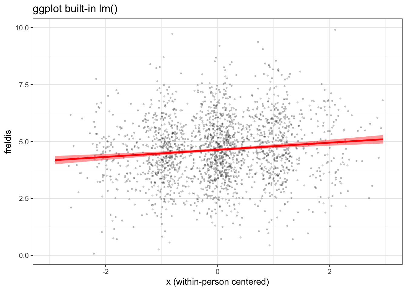
When we view this plot next to the ones we generated previously, in which we used the model to generate the fitted line and confidence bands, we can see right away that the confidence band is too narrow and the slope of the fitted line is a little too steep.
grid.arrange(plot_gg, mlmplot, mlmplotb, ncol = 3)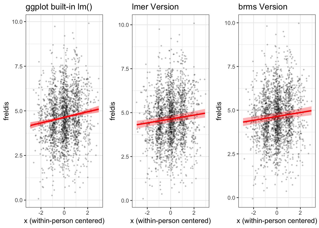
View .Rmd source code
updated March 19, 2019